Dubai Airports
Overview
Problem
Dubai International handles 95.2M passengers a year. Its map gave every one of them the same view, with every search, icon and panel at the same weight, in an interface that looked nothing like the maps people already use.
Key decisions
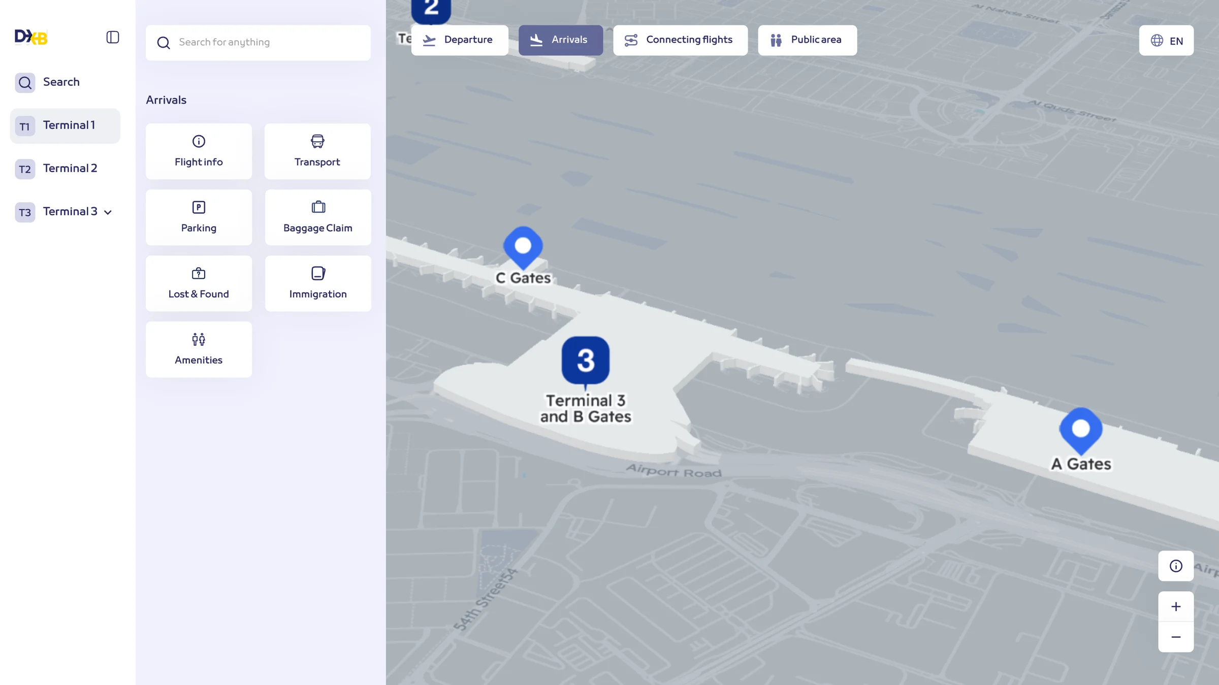
The map now starts with what you came to do. Departing, arriving, transiting or meeting someone: each sets the map up for that trip, with its first answer up front.
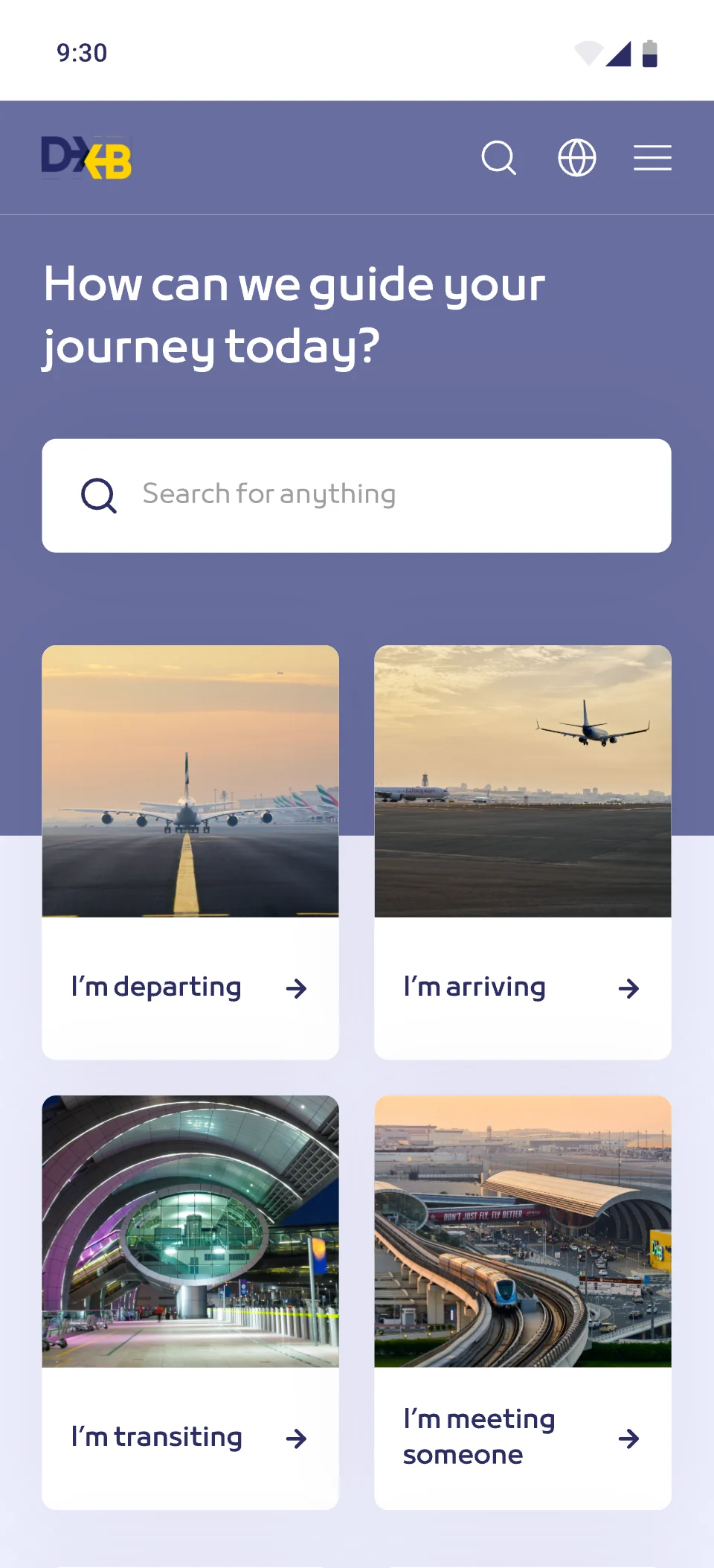
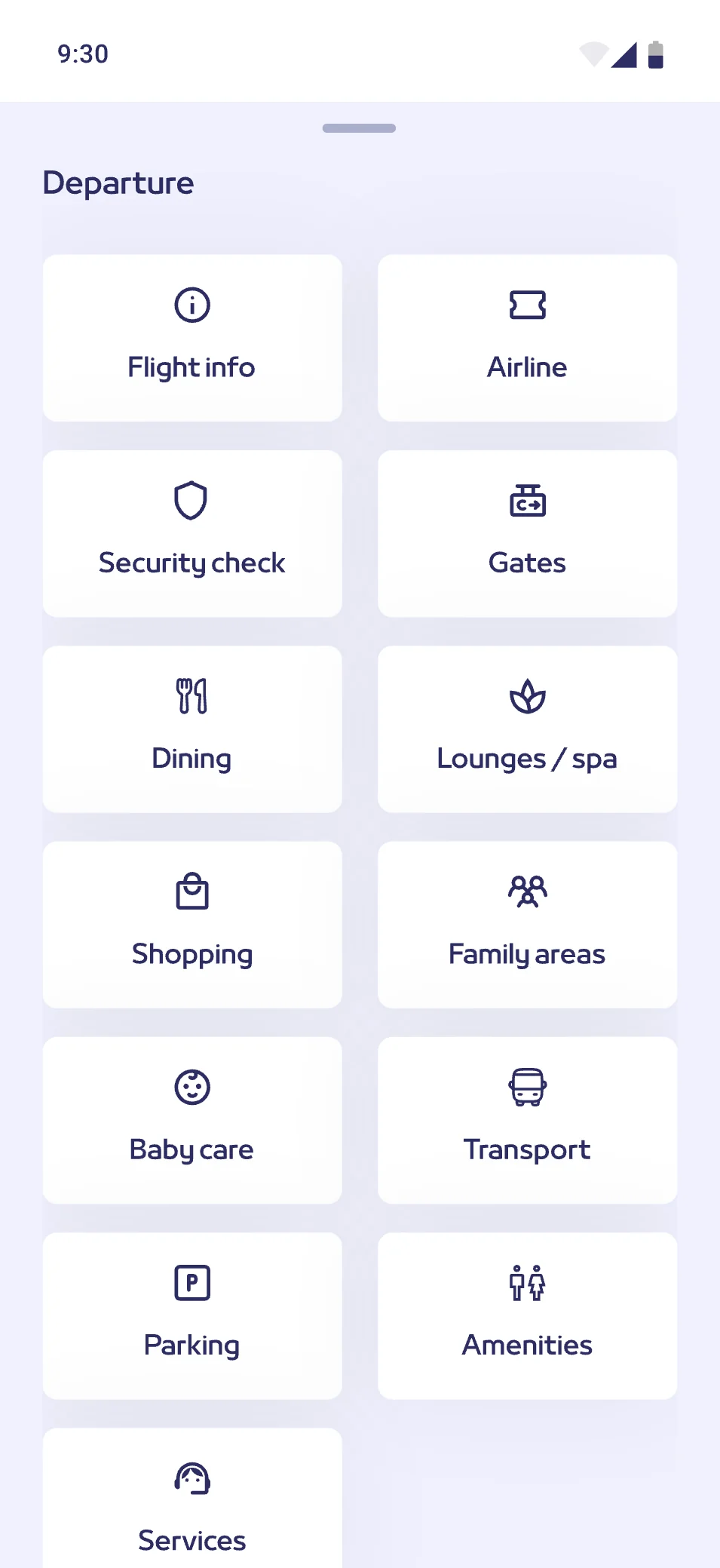
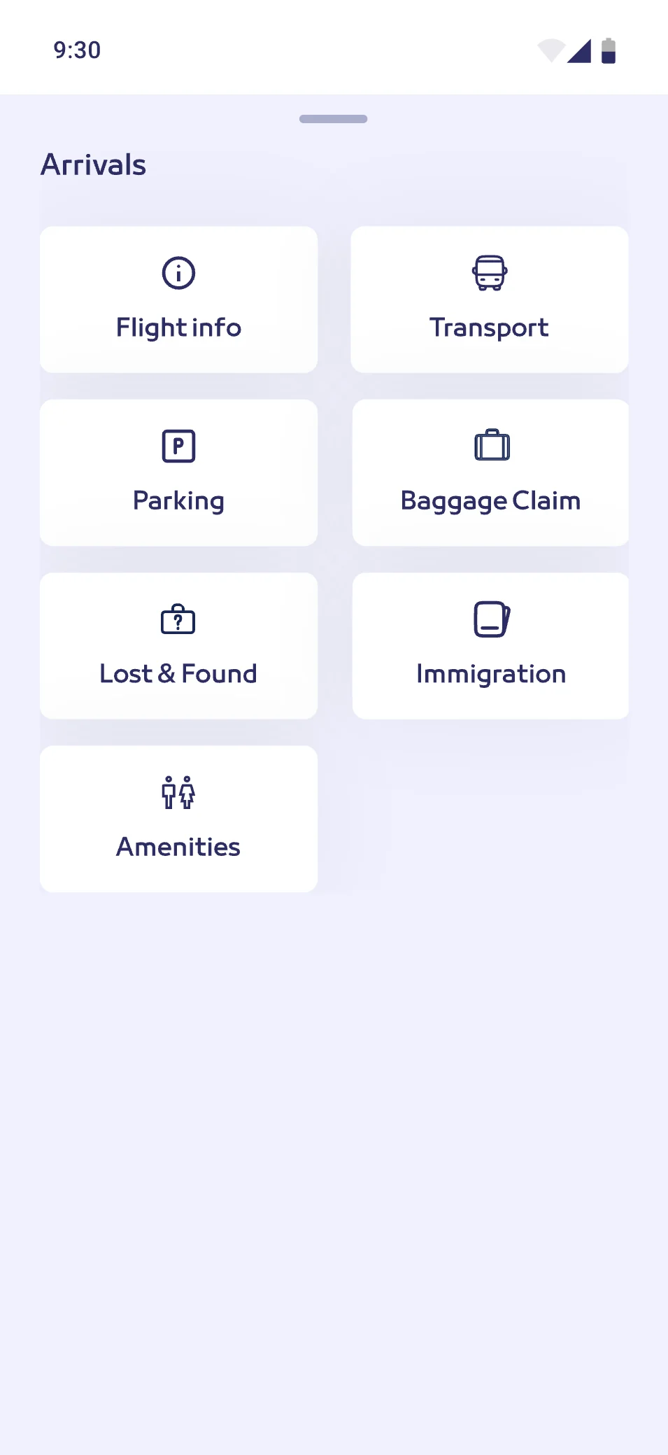
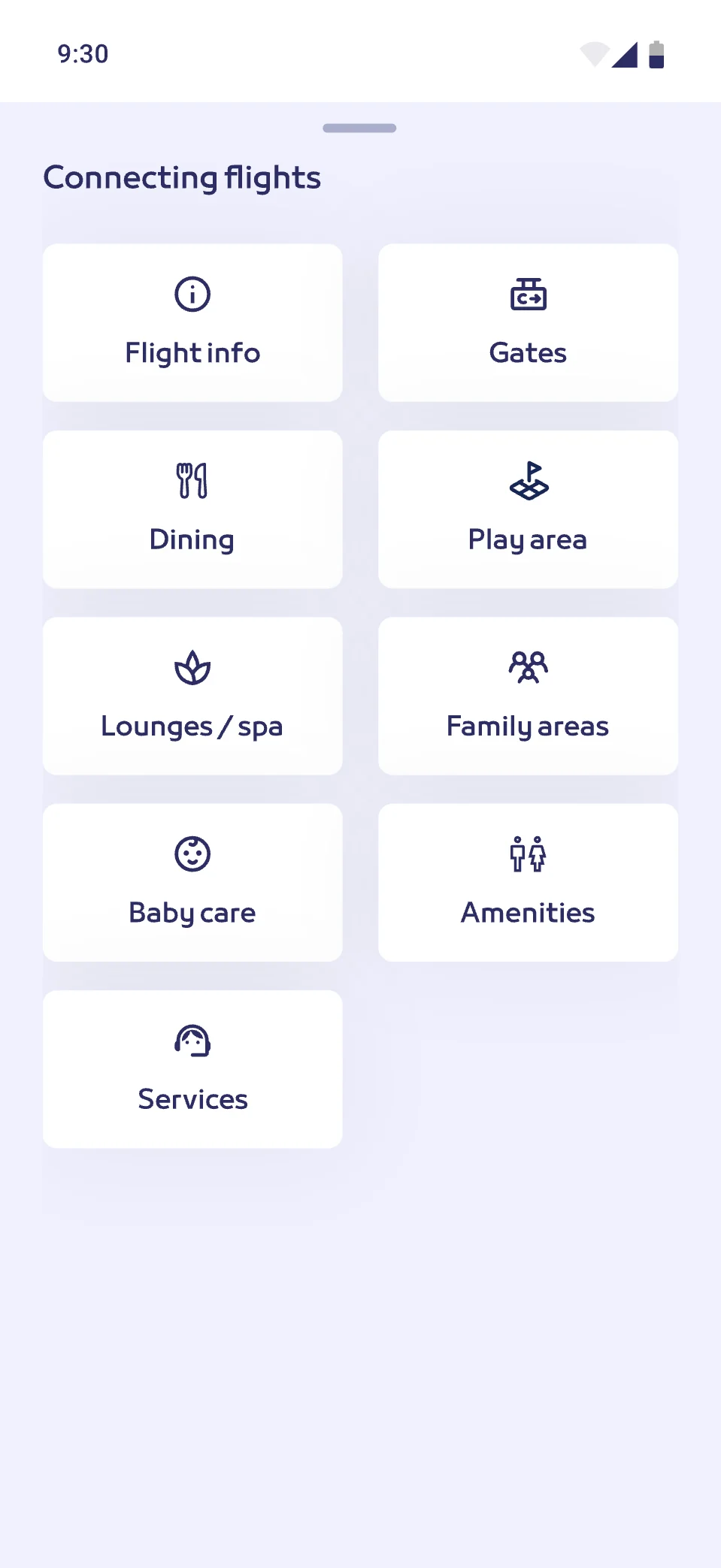
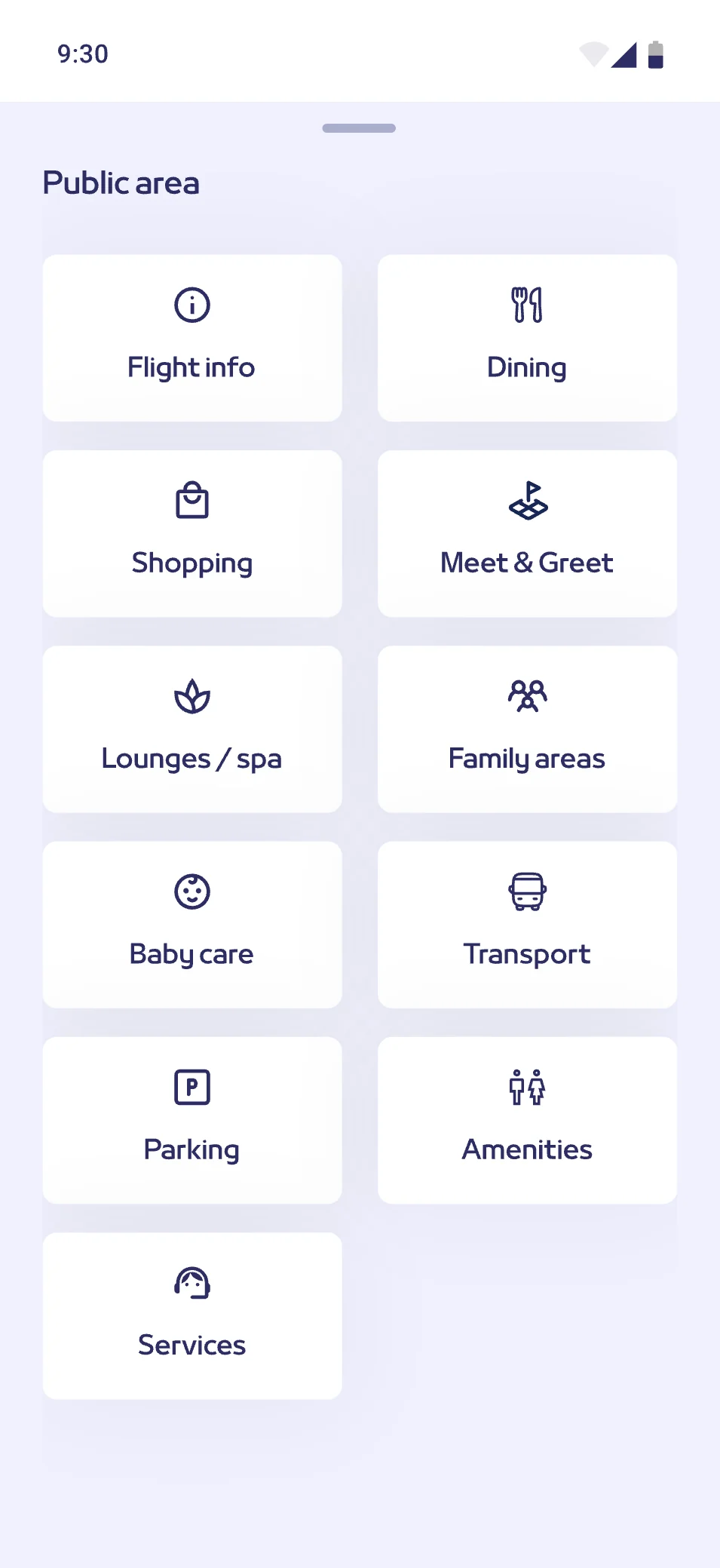
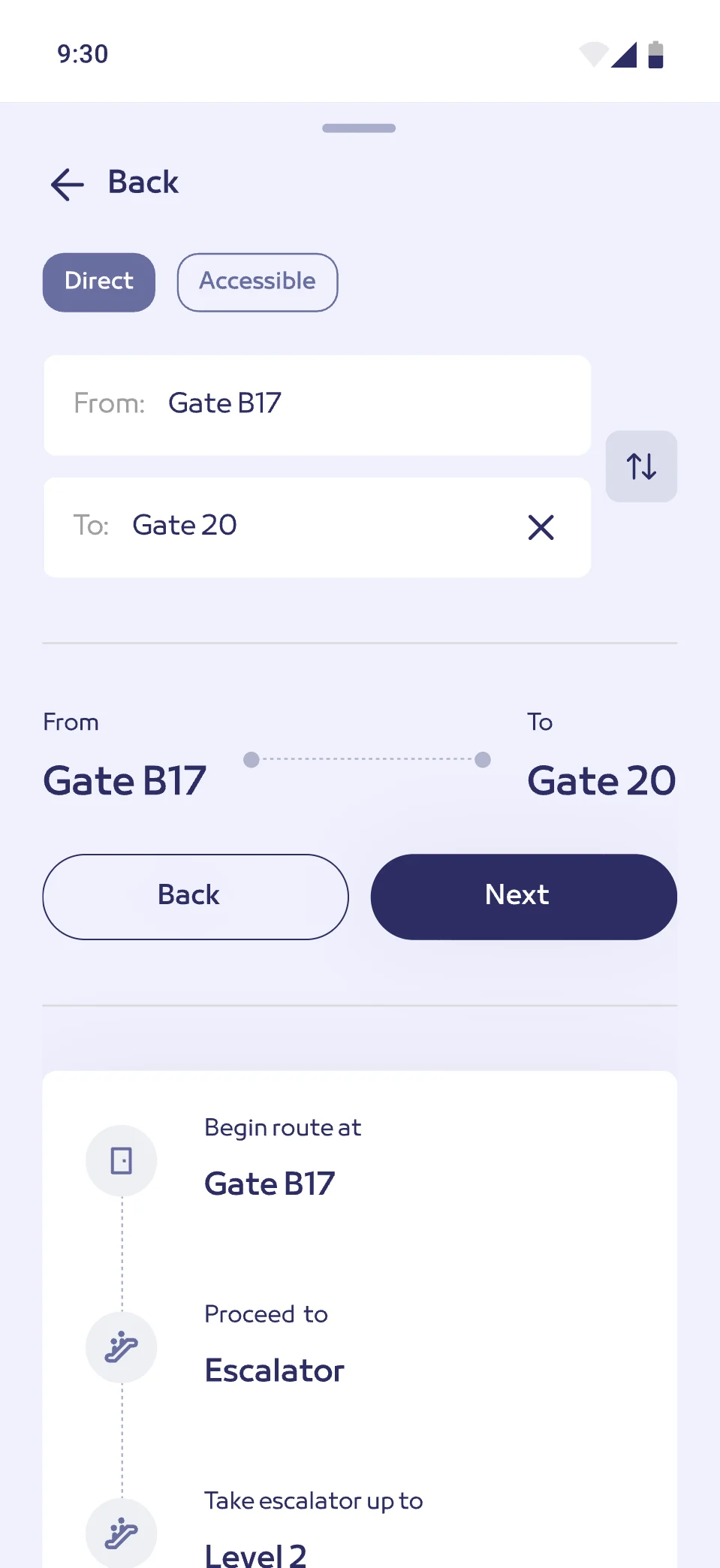
Routes and key places come forward and everything else steps back, so a gate takes a glance, not a scan. Directions read as plain steps, gate to escalator to level to gate.
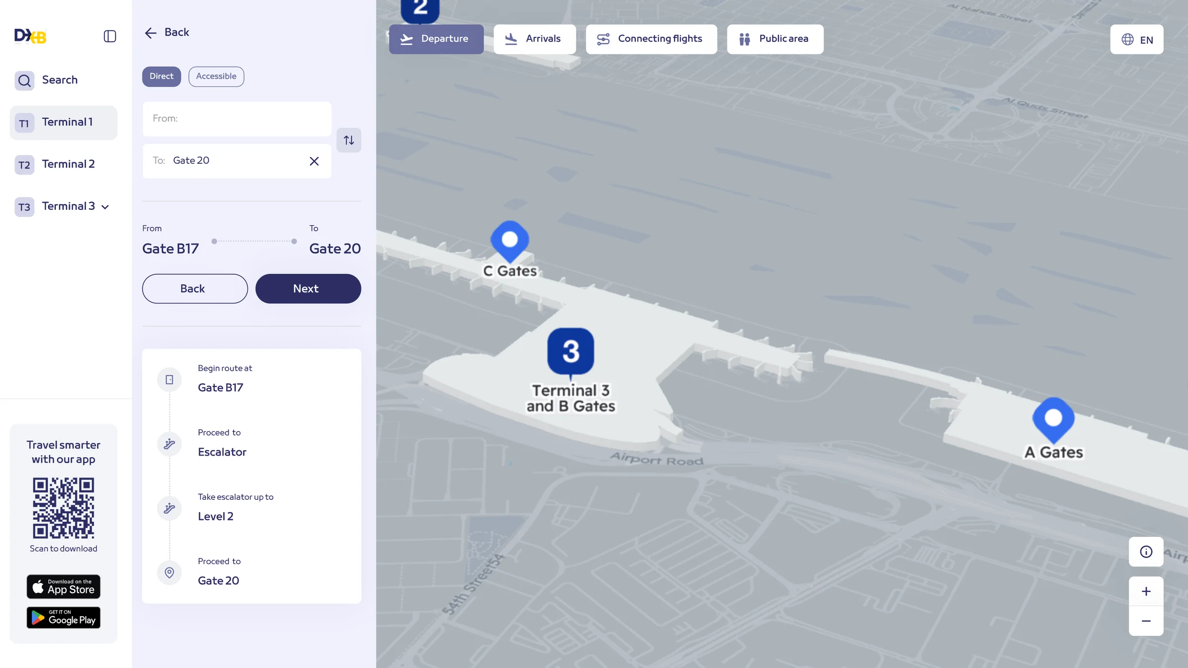
- Begin route atGate B17
- Proceed toEscalator
- Take escalator up toLevel 2
- Proceed toGate 20
Search, results, details and directions behave like the maps in everyone’s pocket. The map itself was fixed, so every decision went into the layer on top of it.
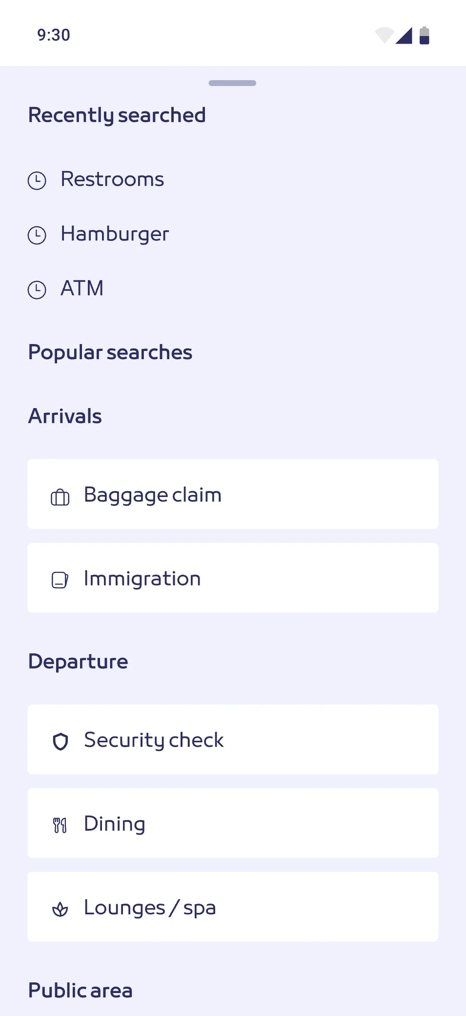
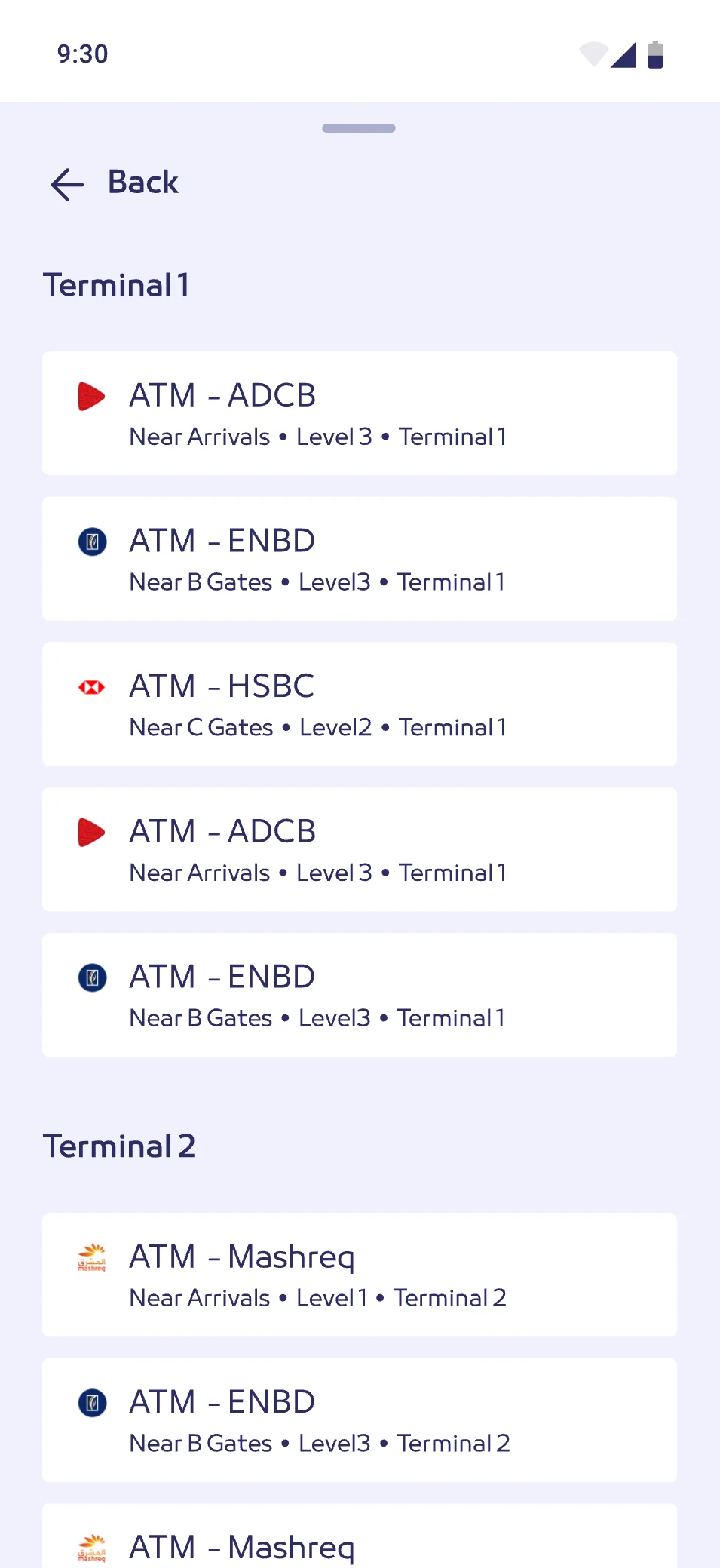
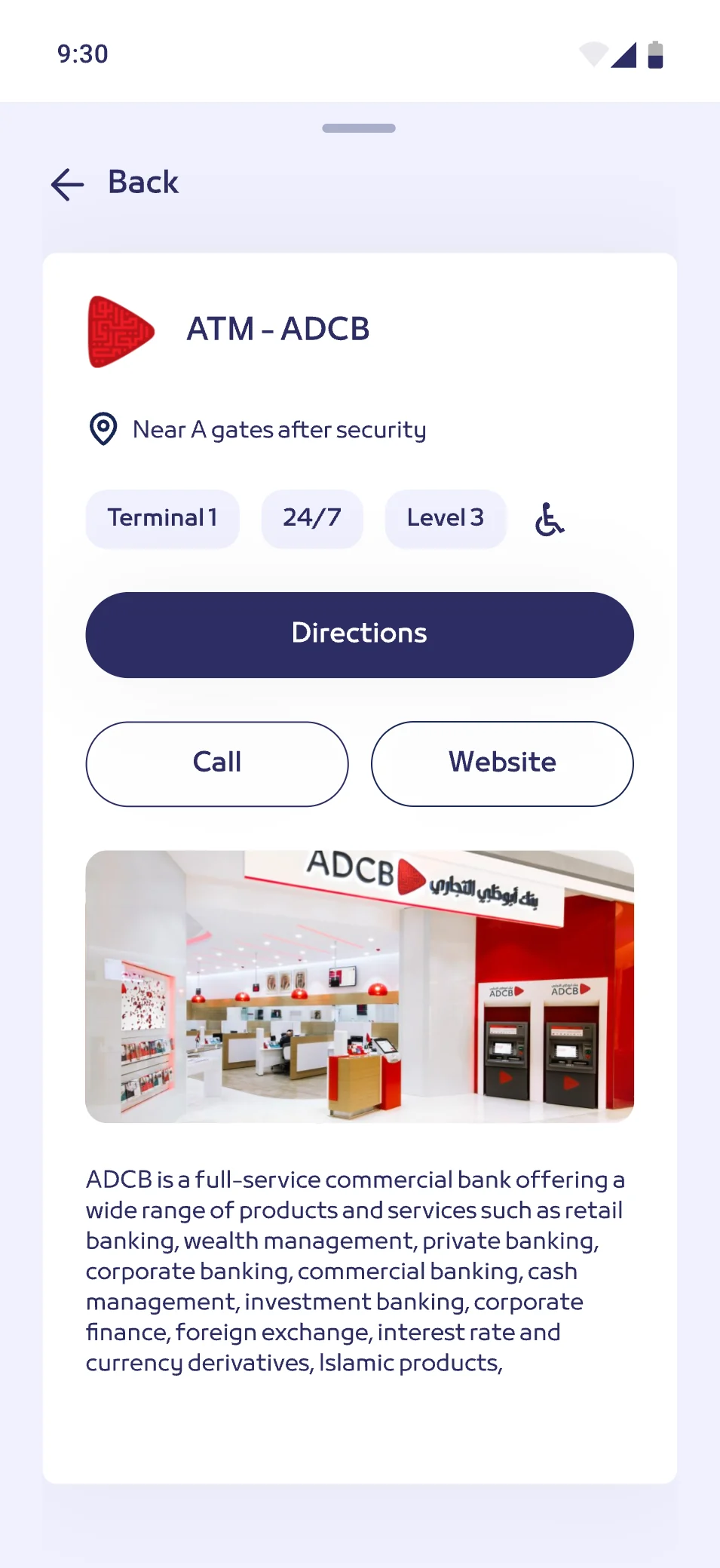
A map only helps if people find it before they need it. It was hard to reach from the main website, so the work went past the brief: the maps and the app surface from the home page.
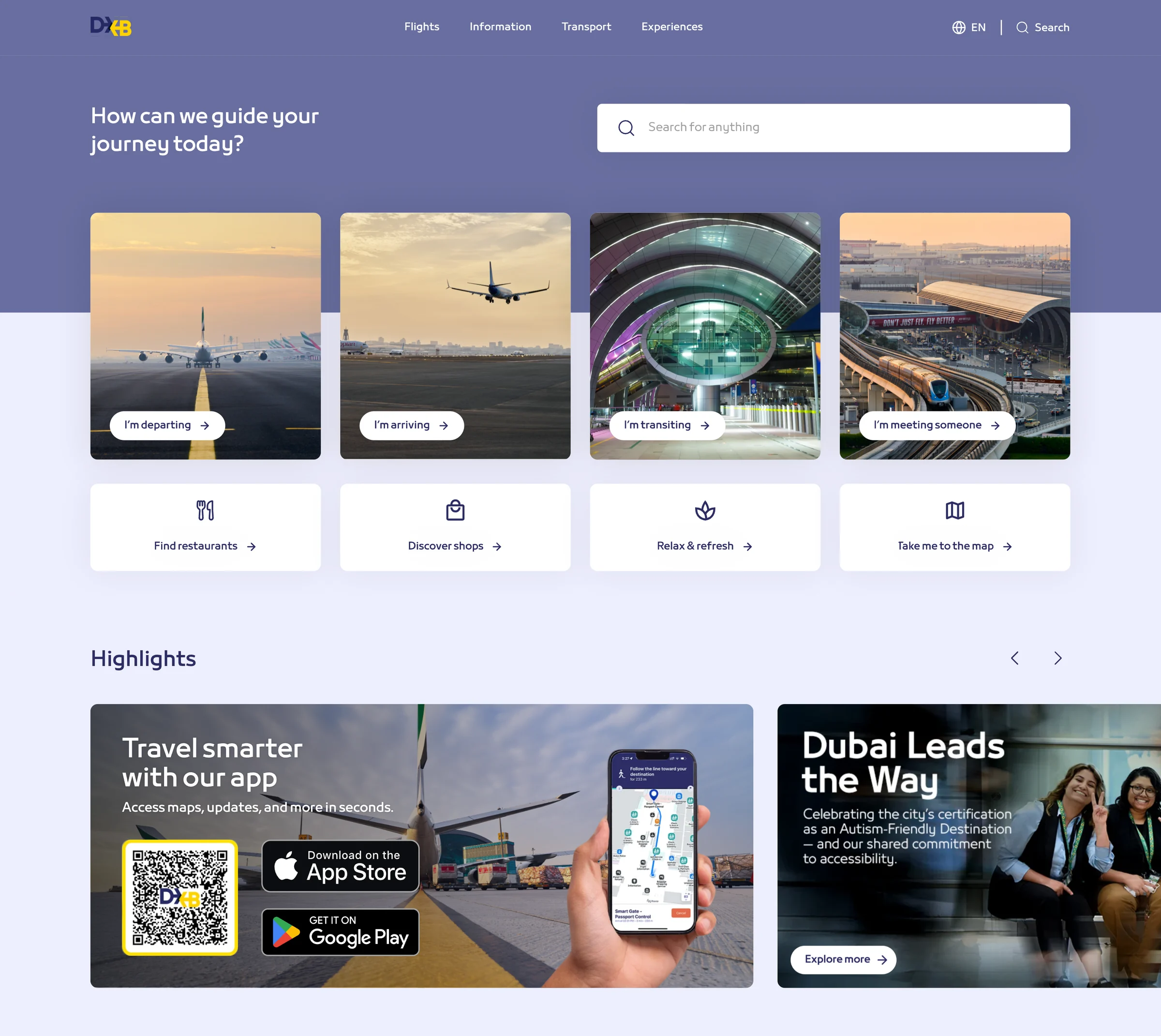
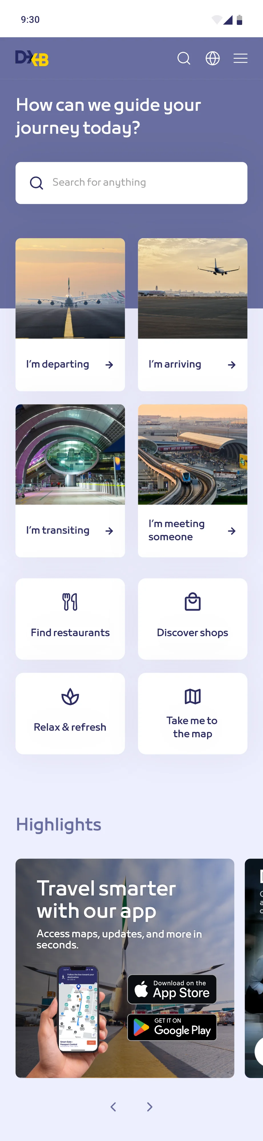
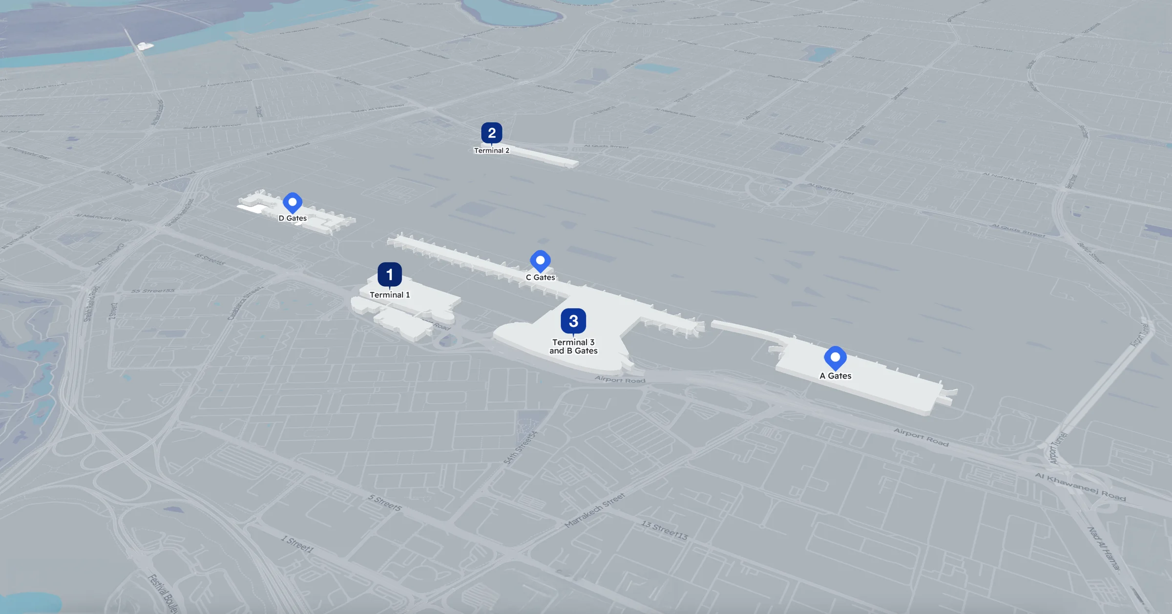
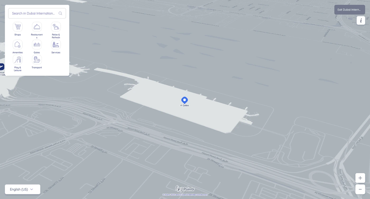
Before and after
Less on screen at once, and patterns people already know.
Outcomes
-
4Ways in, by what you came to do
Departing, arriving, transiting or meeting someone.
-
95.2MPassengers a year
At the world’s busiest airport for international traffic.
-
LiveOn dubaiairports.ae
Clear on every screen, from desktop to phone.
People getting lost? Let’s make it obvious.
Chat on WhatsApp